Petrol / Gas Pump Embedded App

21
Créés sur 99designs par Vista
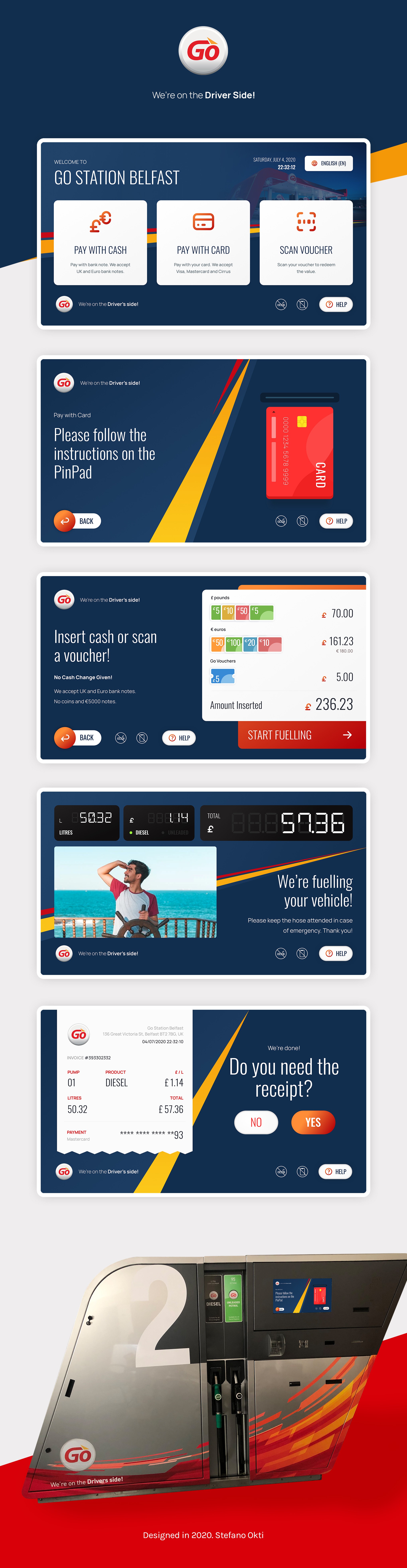
Pump-embedded app for UK-based petrol company
—
A simple yet modern look is used in these designs with big size button and information to maximize the usability for the users when using the app in 21.5" screens.
A 14-segment font is used on the fuelling screen to mimic the traditional pump showing the numbers when fuelling.
—
The client requested the blue color scheme when on the final round but later revert back to red on the final deliveries.
—
Basic Icons from Tabler Icons
.
Illustrations and order icons are custom-made by me.
—
Created for SWIFTsoft for GO Petrol Company.