
Créés sur 99designs par Vista
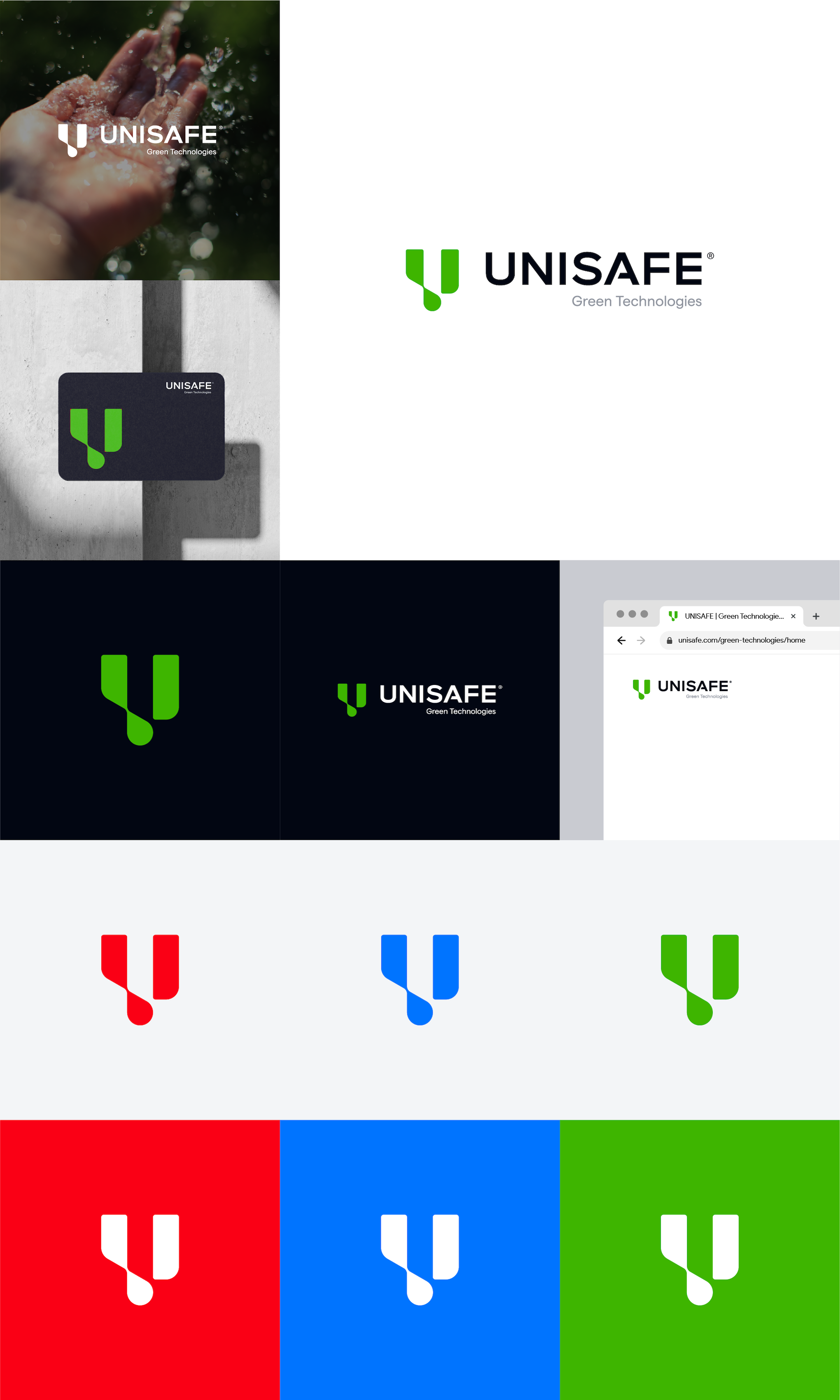
The mark is coming from a simple yet unique monogram-based graphic 'U', I pushed Unisafe forward with a much bolder brandmark inspired by Unisafe's Logo by keeping the waterdrops in a smart shape. It captures of what Unisafe did in its business which focuses on sustainable green products relating to engineering.
The connection between the first of mark "U" block captures sustainability. It well-representation the identity in a unique way. The right block hold on the engineering-related solutions means that emphasis foresight also means balance and consistency.
I push the mark to become slightly rounded to keep the identity become approachable and friendly. It captures the green technologies values overall.