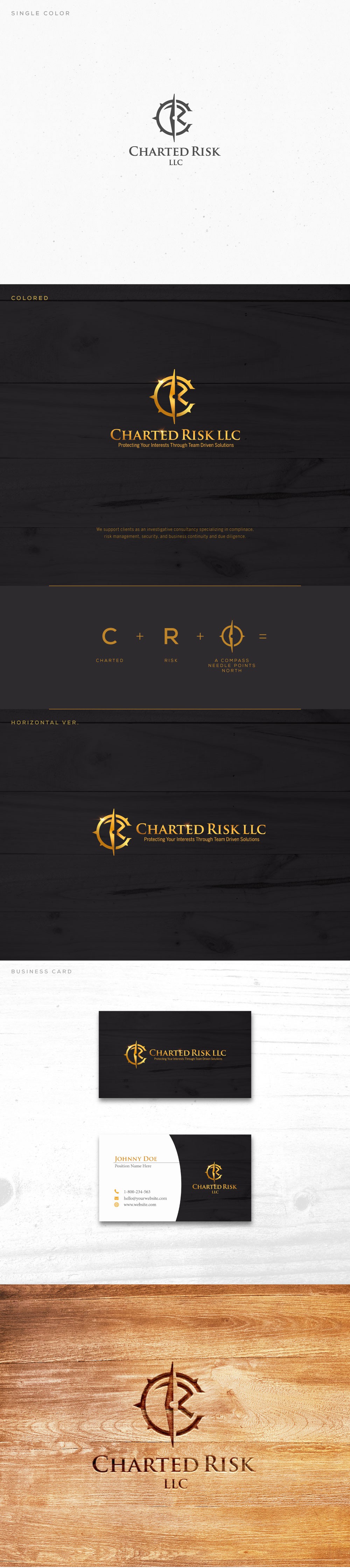
The client would like the C and the R in the company's name to be more prevalent on the logo. They are charting a path forward for companies identifying hazards so I used a compass shape to incorporate in the design.