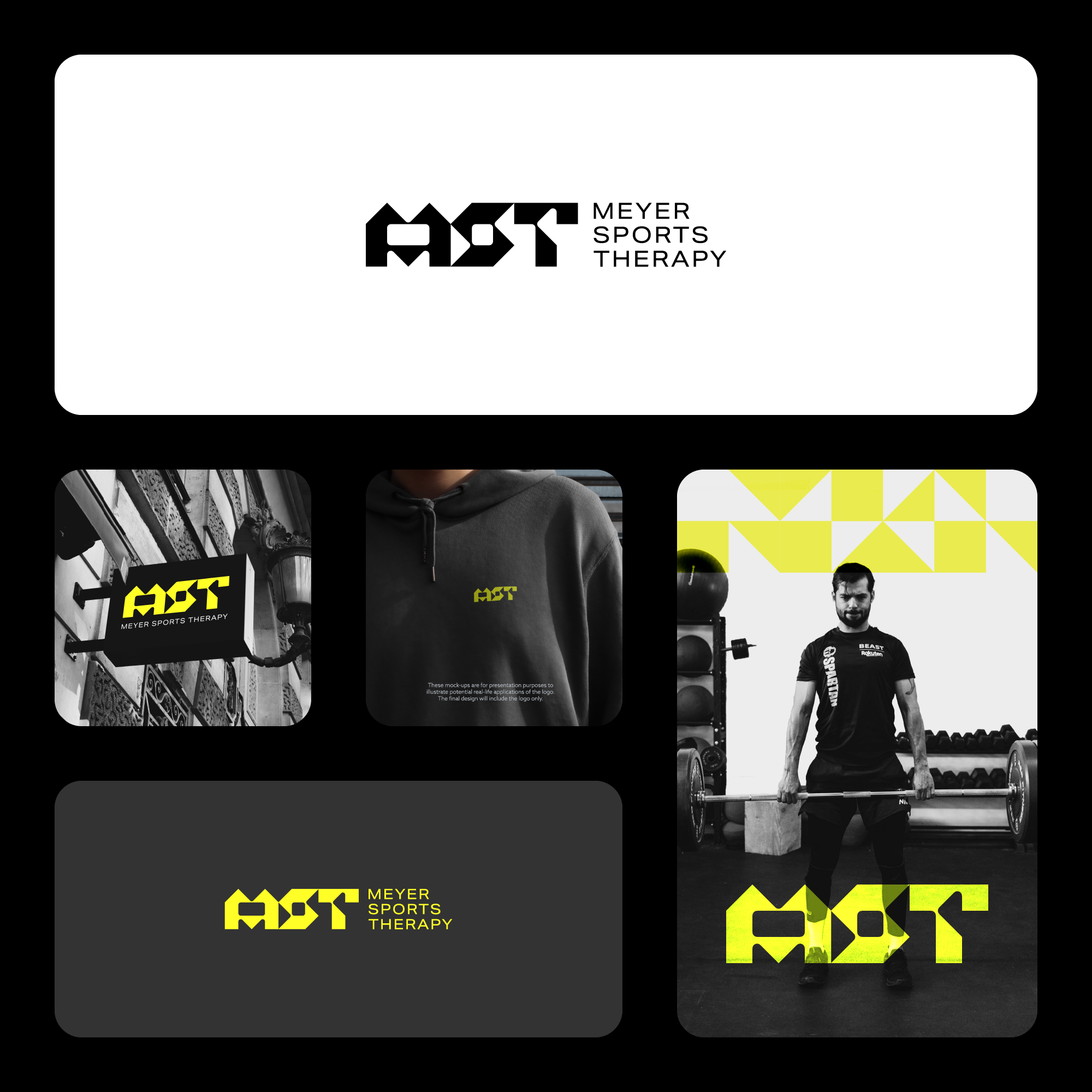

The concept for this logo is rooted in modernism, with a strong focus on typography. The goal was to create a unique, timeless font for the logo mark that embodies a strong, structured design. Its minimalist style, built from triangles and squares, ensures versatility. It can be paired with patterns to add a dynamic touch when used in brochures, advertising, stationery, or business cards.
The combination of neon green with blacks and greys adds a bold, futuristic feel, perfectly suited for a modern clinic. The neon green injects energy and vitality, symbolizing growth and renewal—core elements of strength training and physical therapy. The blacks and greys provide a sleek, professional backdrop, emphasizing stability and trust, key qualities in chiropractic care. This color contrast highlights the clinic’s forward-thinking approach while maintaining a sense of reliability and expertise, making the design both eye-catching and appropriate for healthcare.